
I am taking more of an architect's approach to building my first title. Enumerate systems, build mechanics, test them, make sure they are dynamic/modular enough to scale when I change focus to content creation. You don't need a well designed character to prototype those things. However, putting some time into doing so will not only break up the monotony of other tasks, but also will give you a better in-game feeling for the character you are building which can inform your design decisions as you progress because they need to work with the character you are playing. Also.... it makes the prototypes a little more engaging to play than running around as a blue box box or some vaguely human adjacent being.
Initially, while chugging away at my milestone list, I decided I just needed something human-like to tell myself and players that the main character was, in-fact, a human and would be capable of wielding sterotypical medieval weapons and shields and the like. So I put a little time to make it so.
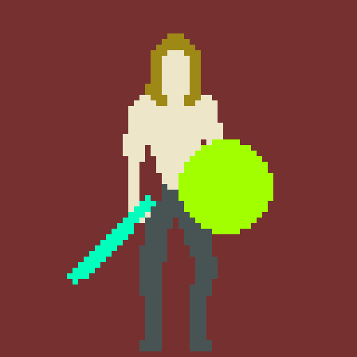
Vic was great. He would dutifully load into each playtest, swing his sword or axe through its attack chain, he would let me know when an attack felt weird or got hit something maybe he shouldn't have, he would help me get a feel for timing of attack animations/parries/etc., he would even make the ultimate sacrifice succumbing to draugr just to make sure the scene would properly reload upon death. I could not ask for more from Vic. But Vic was not without his flaws...
- - Vic only faced 1 direction, making movement and combat feel awkward
- - Vic had mostly a side-scroller perspective, in what is a (mostly) top-down world
- - Vic had no face, which made it hard to say 'I hate your face' when a bug was getting me down
- - Vic was more Fabio's 'The White Knight', than Mikkelsen's Valhalla Rising
Before redesigning, I decided to capture down what I wanted out of my main character's first iteration and to look outward for some insipration. I wanted my character to:
- - Fit both into top-down perspective and side perspective
- - Have human proportions (no giant head and tiny feet)
- - Immediately read as a viking warrior
- - Not have a helmet
- - Not be cartoonish, but still lean into the blockiness of pixel art
- - Feel competent in the game world, but not seem like the master of it
I jogged my memory and my steam library for 2d pixel art games I had played recently. Dead Cells, Hyperlight Drifter, Moonlighter, Blasphemous, Link to the Past (gotta boot it up every couple of years), and Iron Oath all came up on the radar. For gameplay I am leaning heavy Dark Souls with world exploration and some loot elements in a mostly top-down perspective, so I dig in to study the Penitent One and Link. OLD SCHOOL link, not all that Breath of the Wild nonsense!
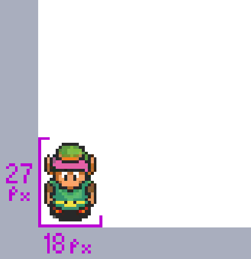
Weighing in at roughly 27 x 18, Link from a Link to the Past is by no means a giant in his world. In this story, he is young and inexperienced, pretty much a child. But he is still slightly larger than a single world tile (about 16 x 16). This gives him a little more strength in the world, but does not make him overpowering by any means. He would appear to be on par with other characters that inhabit the world which would make every encounter feel potentially like a challenge. Take for example the image below:
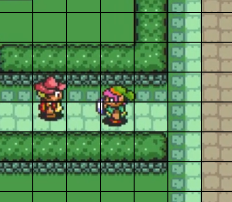
Link is roughly the same height as the squirrelly fellow on the left, and the are both slightly taller than a bush or ground tile (tiles are outlined in black in this image). This gives them roughly equal competency in the game world, and boy is that guy tough to catch until you find a break!
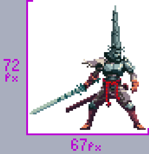
The protagonist of Blasphemous is much taller at about 72 pixels tall. His world, while side-perspective, is smaller in comparison with tiles appearing to be about in the 32 x 32 range. Other people in the world are often smaller than him, as are many of the typical enemies.
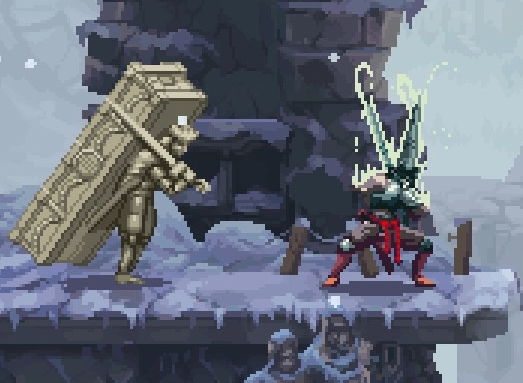
In the picture above, you see the Penitent One facing off against a regular enemy. The enemy appears to be about as tall as the main character in the shot, but you can see that the character is squatting in preparation for an attack indicating he is actually larger. This helps makes the player feel powerful. Height, along with the prowling stance of the Penitent One make him seem like he is very much in control of the world around him... which is actually somewhat dissonant with the gameplay if you are as bad at it as I am.
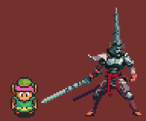
Looking at the two characters side by side you can notice some things beyond the obvious proportional differences. Link has a black outline around his major features like his hat, face, arms, torso, and legs which give create a lot of contrast but make him look like a cartoon. Penitent One has little to no black and no outline present. Link's colors are very saturated and bright while Penitent One is more muted and the light to dark range is lower. Penitent One has more room on-screen dedicated to showing the shape of various parts of his body, clothes, and armor while link is more of a chibi silhouette with a few details to make him recognizable.
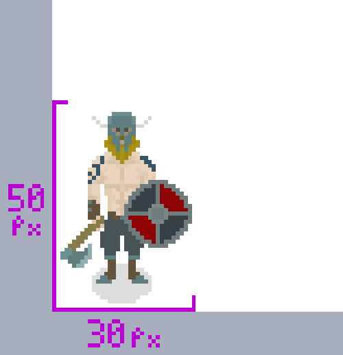
This Favored Son of Odin is roughly in line with Link's height ratio sitting at about 50 pixels tall in a world mostly constructed with 32 x 32 tiles. Most colors I chose are low contrast with each other, which I am hoping will add weight to more saturated shader effects to communicate special statuses and states. His body does have some shape to it. but it isn't so detailed as to be pushing for any degree of photo-realism. To fit the top-down perspective you will notice that more real-estate is dedicated to his head, torso, and arms than his legs and his feet are presented more as being seen from the top of the boot.
I still felt like I had limited real-estate for his head and every attempted hairstyle failed to really communicate 'Viking' to me, even with the bare chest and tattoos, so I decided to grant him a horned-helmet. I know, it was part of my 'success criteria', but after working on it a bit, I can feel the helmet growing on me. The curve of the eye slots lets me communicate a degree of intensity that I was missing and the horns give me a little more room to play with the silhouette.
There is definitely some more refinement of the character to be done, but this iteration should carry me through the rest of my prototypes and maybe even a demo. Keep an eye out for more visual updates in a future post!
-TheHocken
